
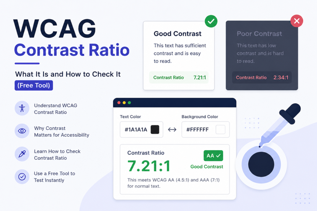
The WCAG AA standard requires a contrast ratio of at least 4.5:1 for normal text and 3:1 for large text. WCAG AAA requires 7:1 for normal text and 4.5:1 for large text. These ratios measure the difference in brightness between text color and its background — the higher the number, the easier the text is to read for people with low vision, color blindness, or anyone using a screen in bright sunlight.
If your site fails these ratios, you’re not just risking an accessibility complaint — you’re making your content harder to read for a meaningful share of your visitors.
What Is a Contrast Ratio, Exactly?
Contrast ratio is a mathematical comparison of the relative luminance (brightness) of two colors, expressed as a ratio from 1:1 (identical colors — no contrast at all) to 21:1 (pure black on pure white — maximum contrast). The W3C’s Web Content Accessibility Guidelines (WCAG) define minimum ratios that text must meet against its background to be considered accessible.
WCAG Contrast Ratio Requirements
| Text Type | WCAG AA (minimum) | WCAG AAA (enhanced) |
|---|---|---|
| Normal text | 4.5:1 | 7:1 |
| Large text (18pt+ / 14pt+ bold) | 3:1 | 4.5:1 |
| UI components & graphical objects | 3:1 | Not defined |
“Normal text” is anything under 18pt (24px) regular weight, or under 14pt (18.66px) bold. “Large text” gets a lower bar because bigger letterforms are inherently easier to distinguish, even at lower contrast.
Most organizations target AA — it’s the level referenced by ADA-related lawsuits in the US, the EN 301 549 standard in the EU, and most government procurement requirements. AAA is a stricter bonus level, generally reserved for content aimed specifically at low-vision users.
Why Contrast Ratio Matters
- Legal exposure: ADA Title III lawsuits over inaccessible websites have risen every year in the US; insufficient contrast is one of the most commonly cited failures because it’s easy to detect and demonstrate.
- Real usability: An estimated 1 in 12 men and 1 in 200 women have some form of color vision deficiency. Low contrast also affects anyone with low vision, older users, and literally anyone using a phone outdoors.
- SEO signal: Google’s Lighthouse and Core Web Vitals tooling score accessibility issues, including contrast failures, and accessibility is an increasingly weighted factor in how search engines assess overall page quality.
How to Check Contrast Ratio on Any Webpage
You don’t need to manually calculate luminance values. The fastest way:
- Install Web Dev Kit (free, no account required).
- Open the sidebar with Alt+Shift+W (Option+Shift+W on Mac).
- Go to the Accessibility tab and select the Color Contrast / Picker tool.
- Use the eyedropper to sample your text color, then your background color.
- Web Dev Kit instantly shows the calculated ratio and whether it passes AA and AAA for both normal and large text — no manual lookup needed.
For a full-page audit rather than checking colors one at a time, Web Dev Kit’s WCAG 1.4.12 Text Spacing tool (Pro) also simulates a 1280px viewport with WCAG-required spacing overrides, so you can catch contrast and reflow issues in the same pass.
Common Contrast Failures to Watch For
- Light gray text on white (a very common “modern minimalist” design mistake — often lands around 2.5:1–3:1, well under the 4.5:1 minimum)
- Colored buttons with white text where the button color itself is too light (e.g. pastel CTAs)
- Placeholder text in form fields, which designers often style at low opacity
- Text over background images or gradients, where contrast varies across the image
- Disabled-looking states that are actually meant to be read (vs. intentionally de-emphasized disabled controls, which are exempt)
Frequently Asked Questions
What is the minimum WCAG contrast ratio?
The WCAG AA minimum is 4.5:1 for normal text and 3:1 for large text (18pt+ regular or 14pt+ bold).
Is 3:1 contrast ratio good enough?
3:1 only satisfies WCAG AA for large text or UI components — it does not meet the 4.5:1 requirement for normal body text.
What’s the difference between WCAG AA and AAA?
AA is the standard most legal and procurement requirements reference (4.5:1 normal / 3:1 large text). AAA is a stricter, optional enhancement (7:1 normal / 4.5:1 large text) typically used for content specifically targeting low-vision users.
How do I check contrast ratio without coding?
Use a free browser tool like Web Dev Kit’s built-in eyedropper and contrast checker — no design or code tools required, works on any live webpage in your browser.
Check contrast, audit alt text, and inspect typography on any page — free, right in your browser. Install Web Dev Kit.